The 5 secrets of a successful ecommerce landing page
As an e-merchant, you know how important it is to have a landing page that is attractive enough to convert visitors into customers.
But how do you create a page that actually works and achieves your business goals?
In this article, we’ll give you all the elements to create an effective ecommerce landing page.
Whether you’re a beginner or an expert in ecommerce, this guide will help you create a landing page that maximizes your conversion rate and helps you reach your business goals.
So, are you ready to create the ultimate ecommerce landing page? Let’s get started!

Reminder: what is a landing page?
A landing page is a page on a website where users arrive after clicking on :
- A link
- A promotional article
- Or an advertisement
It is usually designed to offer the visitor specific information about your company’s product or service, and encourage them to take immediate action (for example, by purchasing a product).
Landing pages are very important in online marketing because they help attract qualified leads and convert more visitors into customers.
But to make a good landing page, the first step is to know who it is for.
Also read : The 8 essential steps to start an eCommerce business
Secret #1 – Understand the needs of your typical customer
Before you start designing your ecommerce landing page, it is essential that you understand the needs and problems your prospects face.
This will then allow you to create a relevant page that publishes the right content and encourages users to take action.
To do this, start by clearly defining your target audience, so you can better understand their thinking:
- How old are they?
- What motivates their purchase?
- What kind of offers do they like?
- What is their socio-professional class?
- What words do they use?
Next, try to identify the main issues your typical customer has, so you can tailor your content accordingly.
Here are some examples of problems a consumer might face:
- Lack of available time to shop?
- Need a product that is financially accessible?
- Desire to buy ethical products?
- Willing to buy local products?
- Constantly looking for new and interesting offers?
- Etc.
By clearly understanding their needs and issues, you can tailor your marketing strategy and offering to directly address them. You’ll be able to offer potential customers a unique experience that will greatly increase your chances that they’ll buy your products.
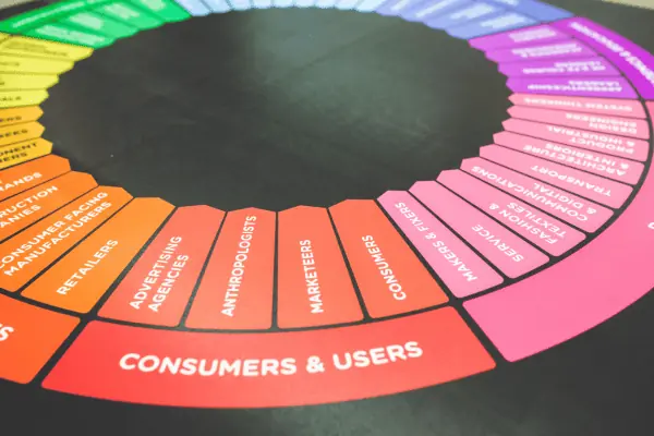
Secret #2 – Tailor your landing page to your target audience’s needs
Once you’ve identified the main problems your target audience has, it’s time to tailor your marketing content to directly address them.
Tailor all the information on the page (text, images, etc.) so that it provides a solution to the problems faced by your prospects.
Basically, you must explain to them how your products / services are exactly what they need.
To do this, don’t hesitate to use short and punchy sentences such as :
- Save time with our products.
- Save money.
- 1 product bought – 2 products free.
- Etc.
This will encourage Internet users to engage more quickly with the brand/product while maintaining a high level of interest in what it offers.
Once this is done, you’ll need to make sure you add all the essential elements of an effective landing page.

Secret #3 – Integrate all the key elements of an ecommerce landing page
To optimize conversion on an ecommerce landing page, there are certain key elements that must be taken into account:
- The layout and structure.
- The quality of content (photos, texts, video…).
- Product descriptions.
- Calls to action (CTA).
- Testimonials and reviews.
Page layout and structure
This is an essential element of any successful landing page. It is important that it is intuitive to easily direct the customer to the main objective of the site (buying).
The structure of the site must be logical so that each visitor can easily navigate to various contents without getting too lost or, worse, leaving your site.
For a successful page and structure:
- Use descriptive titles detailing each section of the website: this will make the ecommerce store easier to navigate as well as easier to read.
- Also, try to use contrasting colors to draw the reader’s eye to important points, such as links to other pages on the site or to the blog.
- Divide each section into distinct subsections to make each part more digestible.
For example: if you want to highlight several products offered by category, try to use tables/lists as much as possible so that each product is well highlighted.
Finally, choose a standard format such as H1/H2/H3… This will not only allow readers to quickly determine each of the points addressed, but also search engines to correctly place the semantic structure of your website for natural referencing.
The quality of photos and images
Photos and images are very important on an e-commerce landing page. Indeed, they can help communicate the advertising messages in a more effective way than words alone.
Good visuals and images can also help grab the consumer’s attention and improve their understanding of your offer.
Incorporating AI into this process can elevate the quality of your visuals. For instance, ‘Midjourney’ employs AI to generate ultra-realistic product images, adding a new layer of appeal to your e-commerce site. To learn more about the benefits of using AI in crafting your visuals, read our article on Midjourney.
If you can, incorporating a video is always welcome. This allows the customer to quickly pick up on key information without having to read.
Therefore, you should make sure that all images used on your landing page are:
- Attractive,
- Visually intuitive,
- And relevant to the advertising message you want to convey.
Also use professional quality photos that accurately reflect the product or service being offered.

Clear and compelling product descriptions
Product descriptions should be short but complete so that they are easier to understand by the reader.
They should highlight:
- Key features,
- Useful information,
- Benefits and/or limitations of the product/service offered.
Try as much as possible to use a punchy tone, using short sentences that directly incite the reader to take action.
Also, don’t forget to mention information about returns/warranties/deliveries, etc.
This kind of detail may seem minor, but it’s important for the potential customer to know every detail before buying. It’ll reassure them.
Powerful calls-to-action (CTA)
A CTA is an invitation to Internet users to buy your products or request your services.
Good calls-to-action are clear and precise and directly encourage Internet users to act.
Here are some examples:
- “Buy now”,
- “Try it for free”,
- …
You can also create CTA buttons to make your page more attractive to your visitors.
Use contrasting colors and adapt the size/shape to the overall design so that it easily stands out from other content. Try as much as possible to use an engaging tone that directly encourages the potential customer to make the final decision.
Testimonials and customer reviews
Testimonials and positive reviews are very useful on a landing page because they allow prospects to get an objective idea of the products/services offered by your company.
You can include positive testimonials from your former customers or invite your current visitors to share their opinion on your website via a form or a social proof rating system integrated to the shop.
This information can be very useful to help the potential customer make a final decision about the products/services offered by your company.
Also, try as much as possible to display your overall ratings on each main page so that your prospects can quickly get an idea of the overall quality of the products/services offered.
So, doing all this can be a bit tricky, especially when you’re not a web designer… But rest assured, solutions exist to make it easier.
Secret #4 – Use tools dedicated to the creation of ecommerce landing page
There are many platforms and software to help you easily create an e-commerce landing page that converts. In fact, let’s take a look at the main ones.
Landing page creation solutions
There are several solutions available that make it very easy to create a landing page for your ecommerce store without the need to master HTML or CSS coding:
- Leadpages,
- Instapage,
- Unbounce,
- etc.
These services not only allow you to quickly design attractive landing pages without resorting to complex coding, but also integrate various plugins that greatly facilitate the management and optimization of your page…
These solutions are very easy to use even for those who do not have a deep knowledge of web design.
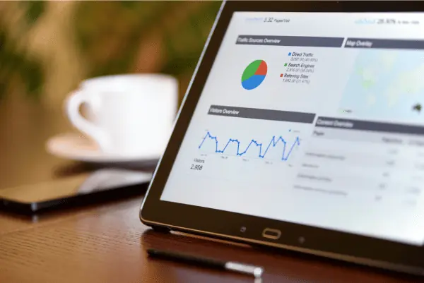
Analytics solutions to measure the performance of your landing page
Once your page is published, it is important that you regularly measure its audience so that you can adapt the content of your landing page accordingly.
Google Analytics is probably the best known tool for this type of statistics, but there are also other services such as KISSMetrics or CrazyEgg that also offer various information such as:
- The bounce rate,
- The average time spent on each section,
- Etc.
This data could be very useful to adapt each part of the website and make sure that it directly meets the expectations/needs of consumers.
Secret #5 – Avoid common mistakes
Creating a landing page for your online store when you’ve never done it before can be tricky.
Many e-tailers make mistakes that are completely avoidable. We’ll help you avoid falling into the trap and will give you the mistakes to avoid when creating a landing page.
Design mistakes to avoid
- A landing page that is too busy can greatly slow down the overall loading of the website, which will certainly have a negative impact on the overall UX.
- Overly complicated navigation could also prevent some web users from finding what they need quickly, which will greatly increase the overall bounce rate.
Sites that are too complicated to understand could also cause a feeling of incomprehension among visitors, which will negatively affect their final decision.
Content mistakes to avoid
- Make sure that all the information provided is relevant and not redundant so as not to lose the readers’ attention.
- Sentences that are too long can also be difficult to read, so try to keep each sentence short and concise.
- Also, make sure your content is clear and concise to avoid confusion and boredom for readers.
- Don’t forget that your page should be optimized for SEO to maximize the chances of being seen by your target audience.
Technical mistakes to avoid
- Loading a web page too slowly will usually cause visitors to abandon it quickly, even if the design is attractive and the pages well written.
To avoid this, make sure your ecommerce store is properly optimized so that it can load quickly even on a mobile network.
Use a tool such as PageSpeed Insights to check how to improve the website’s loading speed and regularly monitor its overall load time.
- Also check if all links leading to internal/external pages are working properly to maximize the overall quality of the customer experience.
Well, now you have all the secrets to set up a landing page that converts. But it’s true that without an example, it can be difficult to get an idea.
So here are 5 examples of successful landing pages

5 examples of ecommerce landing page that work
Making a successful landing page is easy in theory, but it’s still nice to have examples that work. So here are 5 landing pages you can learn from.
- Amazon: Amazon’s landing page is one of the most effective ecommerce landing pages. It’s simple, user-friendly and easy to navigate.
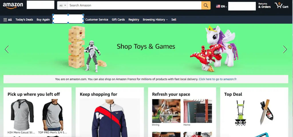
The page has a clear CTA that encourages users to start shopping right away. They use persuasive copywriting to highlight their key benefits and make it easy to find what you’re looking for with the search bar at the top of the page.
- Zappos: Zappos is another great example of an ecommerce landing page that works well. The page features a large hero image, clear navigation, and a prominent CTA that directs users to shop their latest products.
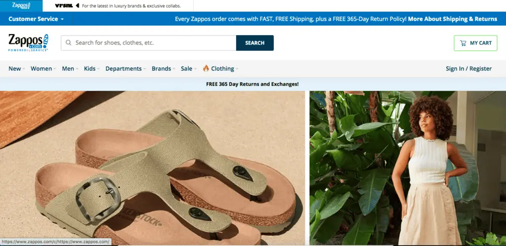
They also use social proof, customer reviews, and a 365-day return policy to build trust and credibility with potential customers.
- Sephora: Sephora’s landing page is a great example of how to create a visually stunning ecommerce page that’s still easy to navigate.
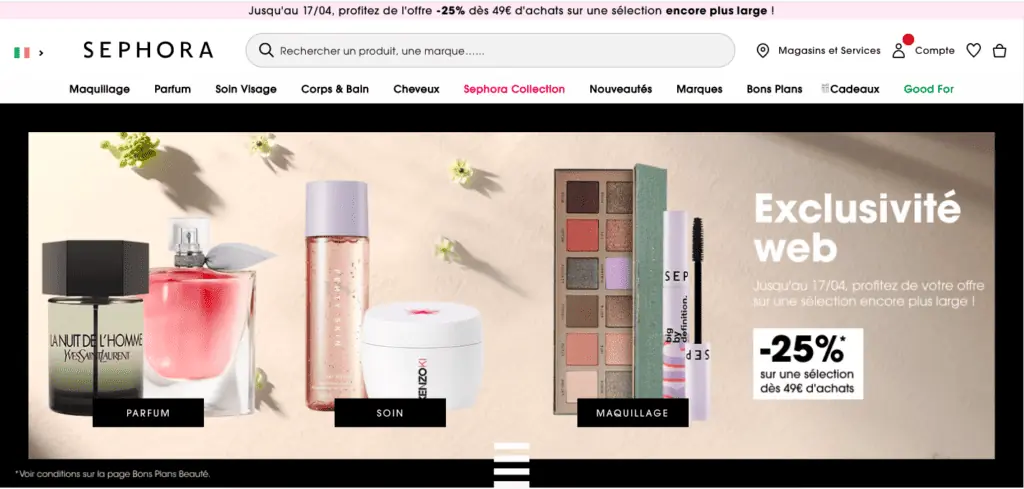
The page features high-quality images and a clean design that helps customers quickly find what they’re looking for. Sephora also provides customers with personalized recommendations based on their previous purchases, making it easier for them to find the products they need.
- Nike: Nike’s landing page is a great example of a page that highlights the latest products and collections.
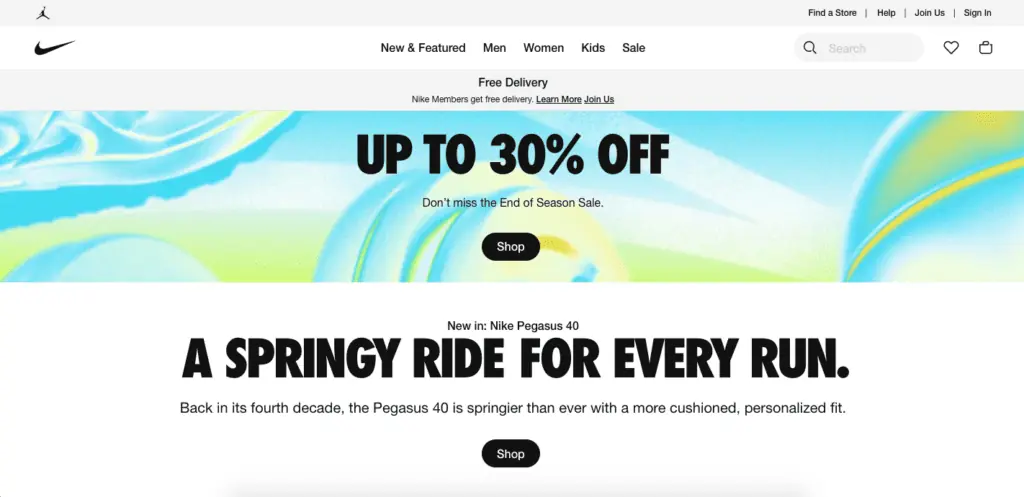
The page features high-quality images and bold typography that captures the brand’s energy and style. Nike also includes a prominent CTA that encourages customers to shop their latest arrivals, making it easy for them to find what they need.
- Warby Parker: Warby Parker’s landing page is a great example of how to use storytelling to connect with customers.
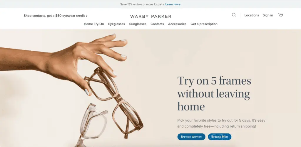
The page features a compelling narrative that explains the company’s mission and how they’re changing the eyewear industry.
They also provide customers with a virtual try-on feature that helps them find the perfect pair of glasses before they buy. The page includes a clear CTA that encourages customers to shop their latest collections.
The secrets of a successful ecommerce landing page in brief…
In short, a good ecommerce landing page is essential if you want to increase your conversion rate and improve the overall profitability of your online store.
To make a good landing page for your online store, you need to :
- Understand the needs of your audience.
- Tailor your landing page to your prospects’ needs.
- Integrate all key elements into your landing page.
- Use the tools at your disposal.
- Avoid making the most common but avoidable mistakes.