Best Practices for Effective Data Storytelling: Insights from Leading Providers
Data storytelling is not just a skill but a strategic tool. In today’s data-driven landscape, data-driven insights must be communicated effectively to make informed decisions.
According to Leapmesh, Data-driven stories can boost audience engagement by up to 300%. This article will cover the best practices for creating data storytelling that resonates with various audiences and leading data visualisation companies in different domains.
Best Practices for Data Storytelling
Data storytelling emerges as a crucial strategy for transforming raw data into compelling stories. We can create data stories that captivate and inform audiences using these techniques and best practices:
Choose the Right Visual Elements
Visual elements are critical since each chart or graph tells a different story. A line chart is excellent for showing trends over time, while a pie chart is ideal for displaying proportions in a dataset. The right visual aids can help enhance the clarity and impact of the story, highlighting the key insights without overwhelming the audience.
Maintain Clarity
Data visualization must maintain clarity. It means using clean, uncluttered charts, avoiding unnecessary jargon, and focusing on the most critical data. Audiences can focus on the insights by providing simple data visualizations rather than getting distracted by complicated graphics.
Incorporate Interactivity
Many data stories incorporate interactive elements, especially in digital formats. Viewers can drill down into the data that interests them the most by using interactive charts and graphs. This makes the story more engaging and helps reinforce the data’s credibility by allowing viewers to see how the conclusions are drawn.
Use of Color
Using color strategically in your visualizations can significantly enhance comprehension and retention of data. Colors can draw attention to critical data points, encode categories, and illustrate changes over time. For example, warm colors like red and orange signal urgency or increase, while cool colors like blue and green indicate decrease or calm.
However, it is crucial to be mindful of color blindness by avoiding combinations that are difficult to distinguish for those with color vision deficiencies.
Contextualize Data
Data without context is just numbers. To make your data storytelling compelling, you must provide the background that explains why the data matters. This could include historical data comparisons, industry benchmarks, or explanations of sudden shifts in data. Context helps your audience understand the ‘why’ behind the numbers, making your narrative more relatable and impactful.
Use of Annotations
Annotations are powerful tools in data visualization. They help to clarify what might otherwise be a complex graph or chart. Use annotations to point out trends, note exceptions, or explain what a particular data point means. For instance, annotating a sudden spike in a line graph to explain associated external events can provide deeper insights into the data presented.
Consistency
Maintaining consistency across your visualizations reassures your audience of the reliability of your narrative. This involves using the same color schemes, typography, and visual styles throughout your presentation or dashboard. As a result, audiences can focus more on the story than adjusting to new formats for every slide or graphic, resulting in a reduced cognitive load.
Data Accuracy
The credibility of your data story heavily relies on the accuracy of the data presented. Always verify your sources and double-check data points, especially when they form the basis of major insights or decisions. You should maintain transparency about your data source, assumptions, and manipulations.
Iterate and Refine
Feedback is a valuable tool in refining your data storytelling. After presenting your data story, gather feedback from your audience to understand which parts were most engaging or where they got lost. Use this feedback to refine your approach, visualizations, and narrative iteratively. The goal is continuous improvement, ensuring that each data story you tell is more effective than the last.
Leading Data Visualization Providers
Leading data visualization and analytics providers have developed advanced tools and methodologies to enhance data storytelling capabilities. Here are some of the advanced Leading Data Visualization Providers in different domains:
FlameAnalytics
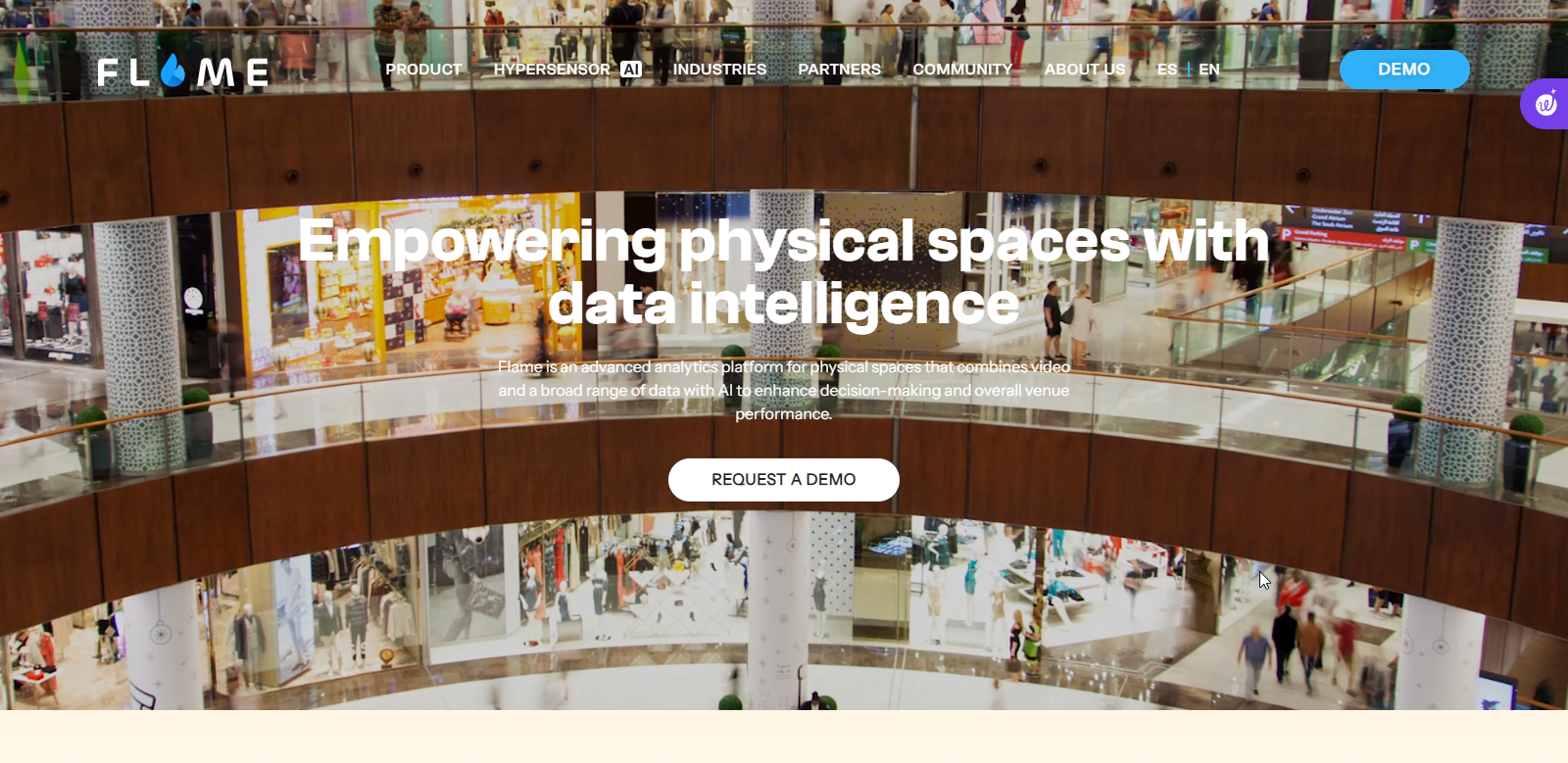
Flame analytics is an advanced analytics platform for physical spaces that combines video, data, and artificial intelligence to improve decision-making. By using it, businesses can learn how customers behave, measure the performance of physical spaces, and boost customer loyalty by connecting with visitors.
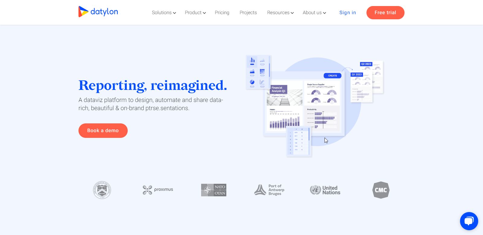
Datylon offers tools for creating stunning data visualizations, making it easier to tell compelling data stories. It provides premium data-driven services to any industry stakeholder at an affordable price, from designing a single chart to automating the production of recurring reports.
Releem
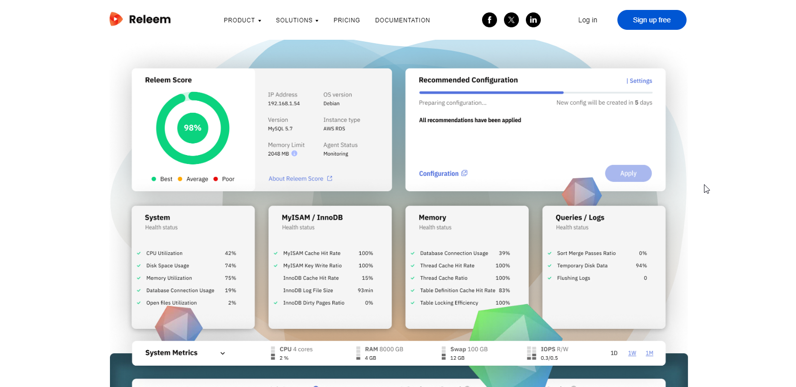
Releem is an easy-to-use MySQL performance monitoring and tuning tool that lets you keep database servers fast, secure and reliable. It automatically identifies performance issues, suggests improvements and applies them.
WaitTime
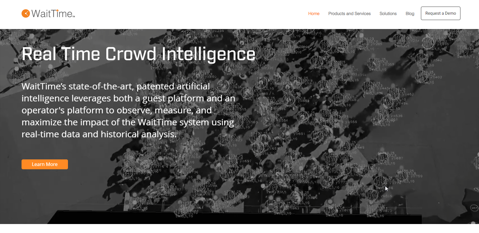
The Wait Times, also known as WaitTime, is an industry leader in crowd intelligence. It provides real-time data and historical analytics on crowd behavior. Its patented artificial intelligence gives operations personnel live data on crowd movement, density, and occupancy while providing guests with the information they need to navigate.
Their technology interprets crowd conditions in real-time, so you always know wait times and crowd densities. This improves business intelligence, and guest experiences and promotes safer spaces.
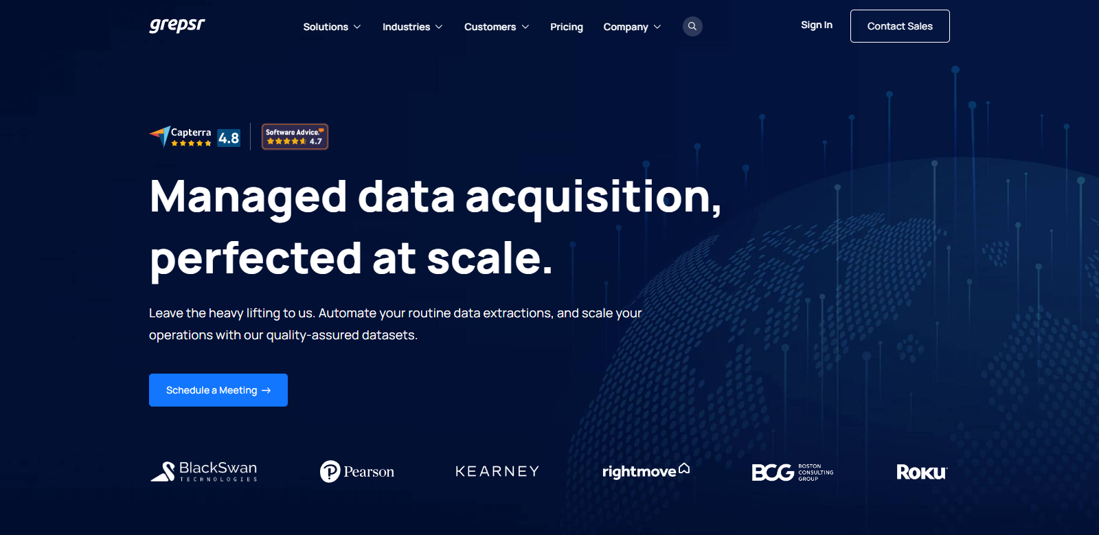
Grepsr is a managed data extraction service; they’re focused on providing tailored web scraping solutions for their clients. With over a decade of experience, they offer a comprehensive suite of services designed to streamline your data collection process.
Whether you require a fully managed Data-as-a-Service (DaaS) solution or prefer a more hands-on Software-as-a-Service (SaaS) approach, Grepsr can build a system that fits your needs. Their team also offers data consultations to ensure you’re on the right track.
For robust, compliant web scraping, Grepsr’s solution meets industry standards. It can handle common website roadblocks, adheres to legal guidelines, and scales to accommodate large-scale data collection. Popular targets like Amazon, Home Depot, and Indeed are all within its capabilities.
However, Grepsr’s most innovative offering is arguably Pline. This AI-powered browser extension revolutionizes data extraction by eliminating the need for manual coding. Through a user-friendly interface, you simply point and click to specify the desired data elements, and Pline retrieves them for you.
Still under development, Pline promises exciting future features. These include AI recommendations for optimizing your extractions, data validation to ensure accuracy, data masking for privacy protection, and comprehensive reporting for clear insights.
The best part? You can experience the power of Pline completely free of charge for a limited time. It’s on their website too, “Unlimited data extraction for a limited time.” This is your chance to explore the future of data collection with Pline’s innovative capabilities.
Viberate
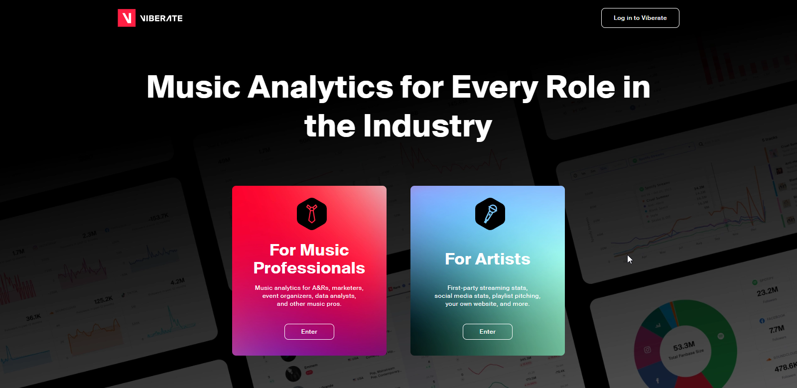
Viberate is a music data company that offers music analytics for industry professionals and DIY tools for independent artists. Its data on musicians, venues, and events provides unique storytelling opportunities.
Strella Biotechnology
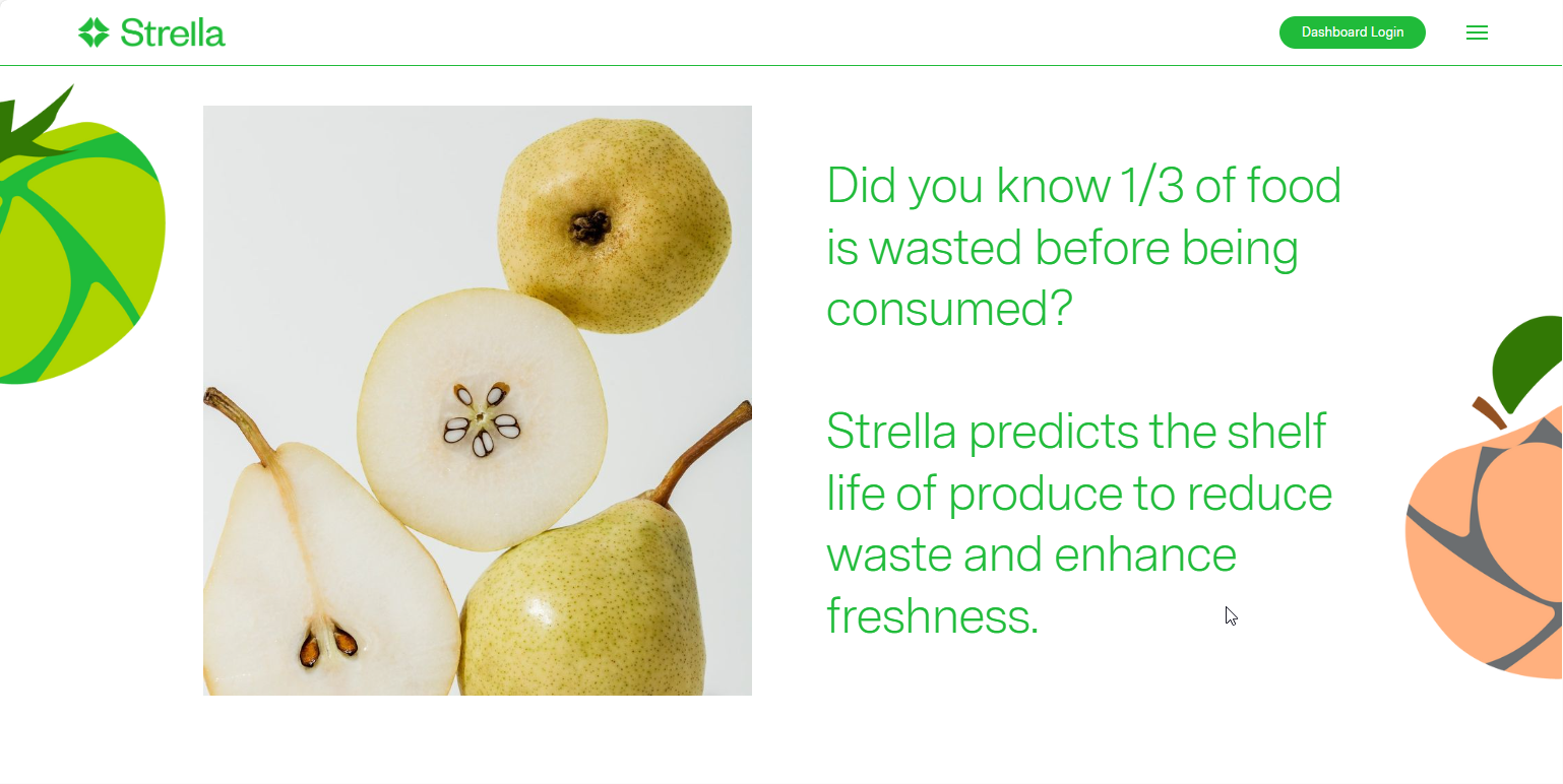
Strella Biotechnology is a leading data visualization provider in the agricultural sector. Their biosensing platform reduces waste and improves product quality by predicting fruit ripeness. This technology is used to monitor 15 percent of U.S. apples, providing valuable data visualization for suppliers, distributors, and retailers. The company was founded by Katherine Sizov and Jay Jordan, has 5 employees, and has raised $16.5M in total funding.
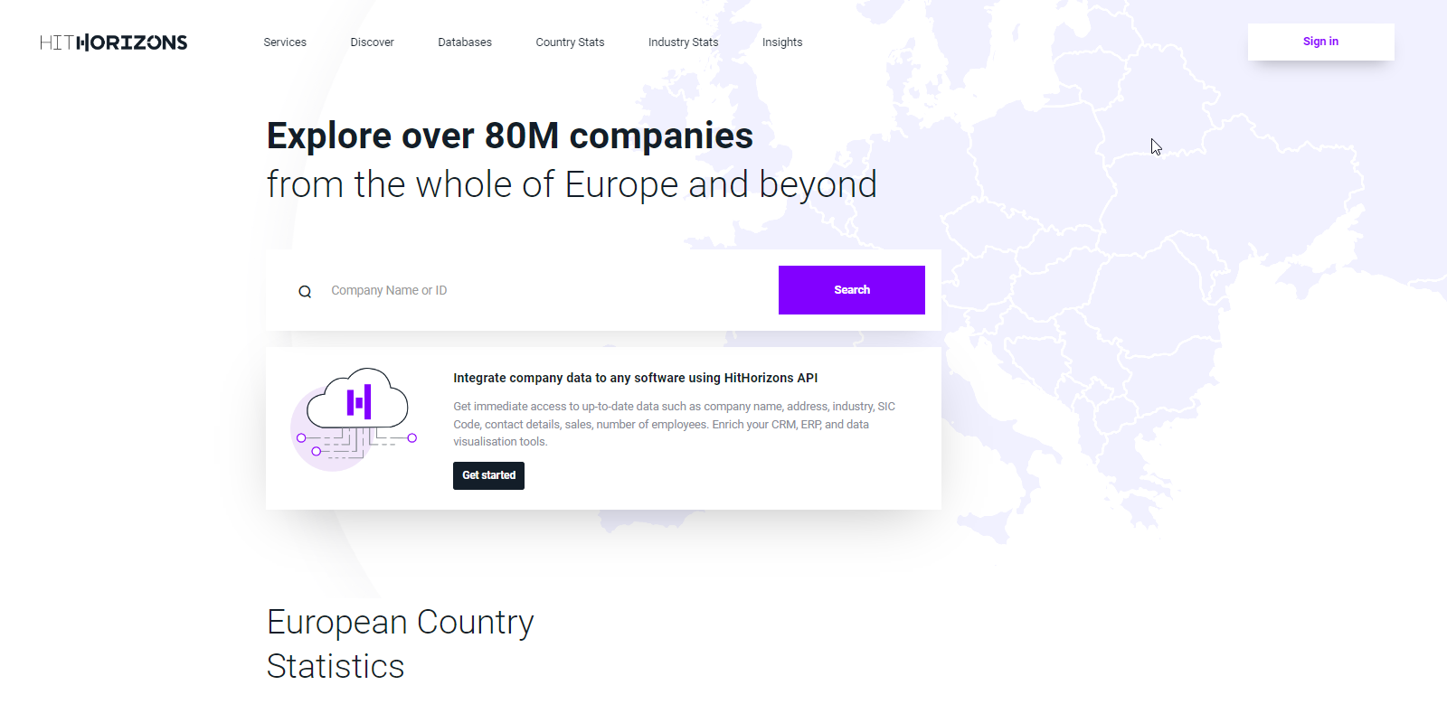
HitHorizons aggregates data on 80M+ companies based in Europe, makes it available via API, and provides additional insights via a SaaS web app. Free version provides company profiles, country and industry statistics, reports, and overviews. The company was launched in 2019 after more than 2 years of development.
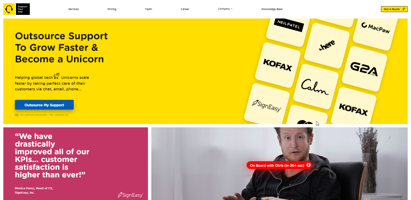
SupportYourApp is a Support-as-a-Service (SaaS) company that provides secure technical, customer support and CX services to growing companies around the globe since 2010.. They offer 24/7 customer service support in 60+ languages.
Their services include customer and technical support, social media customer service, CX services, reception desk services, AI-powered support teams, data annotation, system setup and integration.
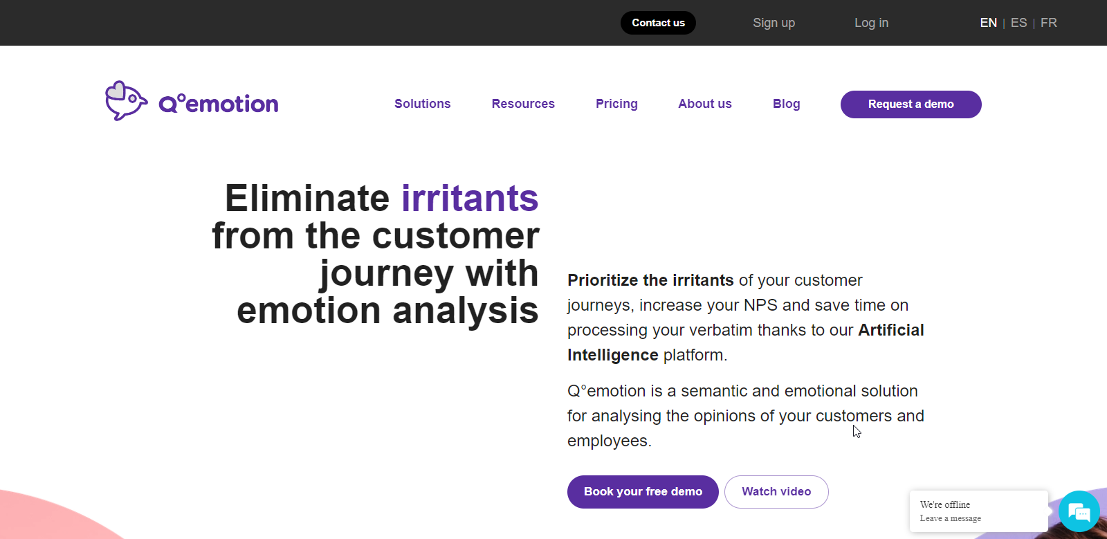
Qemotion uses the power of NLP, Affective Computing, and AI to measure customer experience. It offers a semantic and emotional analysis solution on customer and employee reviews making it possible to detect and significantly reduce irritants in the physical or online customer experience and journey, which positively impacts the NPS and makes it possible to predict customer attrition. A leading data visualization provider in the customer experience sector. The company was launched in 2015.
Skin Match Technology
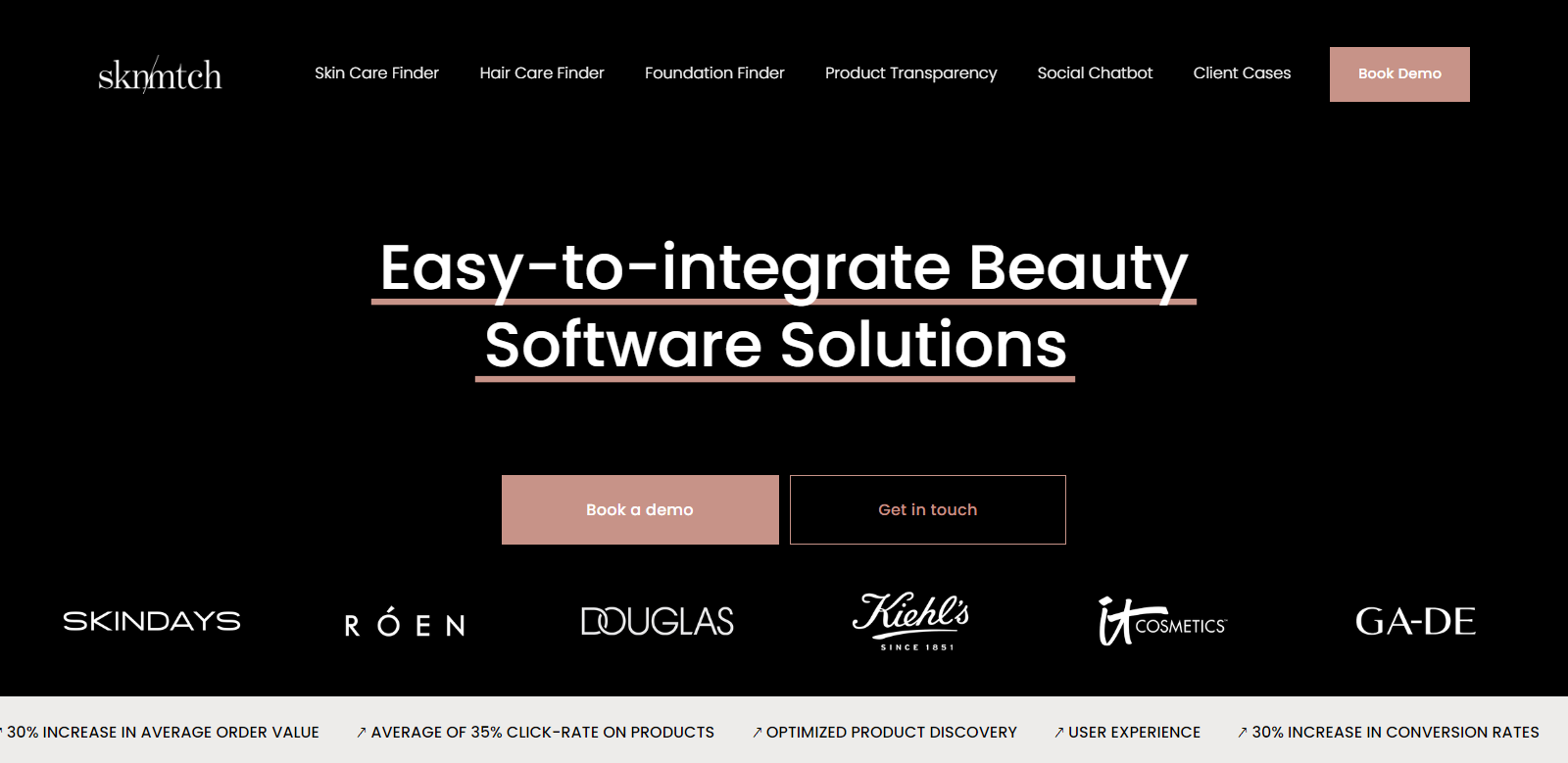
Skin Match Technology provides AI solutions for the beauty industry. They offer beauty software solutions for skin, hair, body, and color cosmetic beauty brands. Their foundation finder integrates easily and wins more customers, providing valuable data visualization in the beauty industry.
BEONx
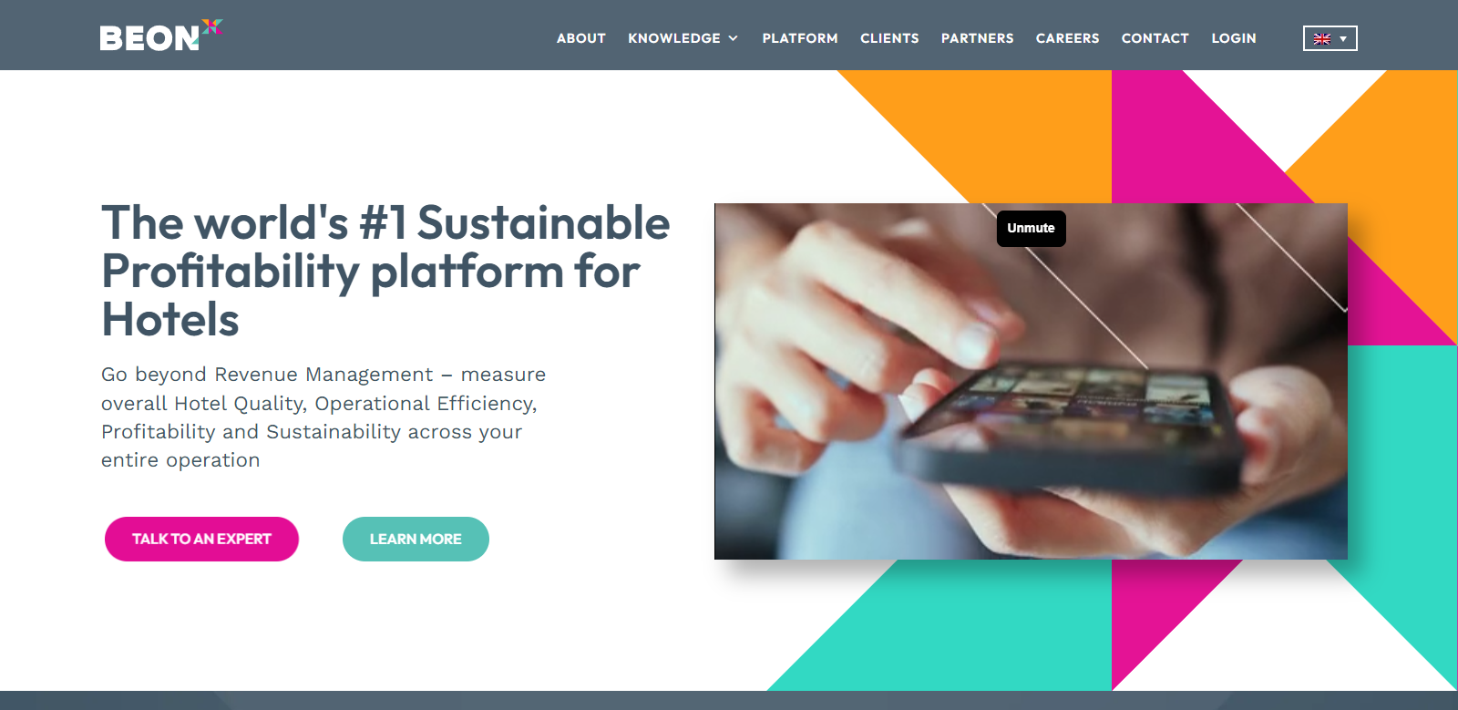
BEONx is a platform for hotels that goes beyond revenue management. It offers a holistic view with actionable strategies, digitalization, and automation. The platform integrates all data in one dashboard, providing quick, intuitive visuals and analysis, making it a leading data visualization provider in the hospitality sector.
Kulkul

Kulkul Technology, also known as PT Kulkul Teknologi Internasional, is a technology-based company that builds software and provides IT consultancy. The company aims to democratize high-quality software engineering. It assists IT decision-makers, project managers, and product owners in enhancing technology usage.
Here are some of the services they offer:
- App Development: They build well-designed and optimized mobile apps for both internal and mass usage.
- Blockchain Development: They develop DApps, NFT marketplaces, and ERC-based tokens with their smart contract development services.
- ERP Development: They provide customized ERP development because every business is unique.
- Website Development: They create customized websites that suit your business and branding.
MUSO
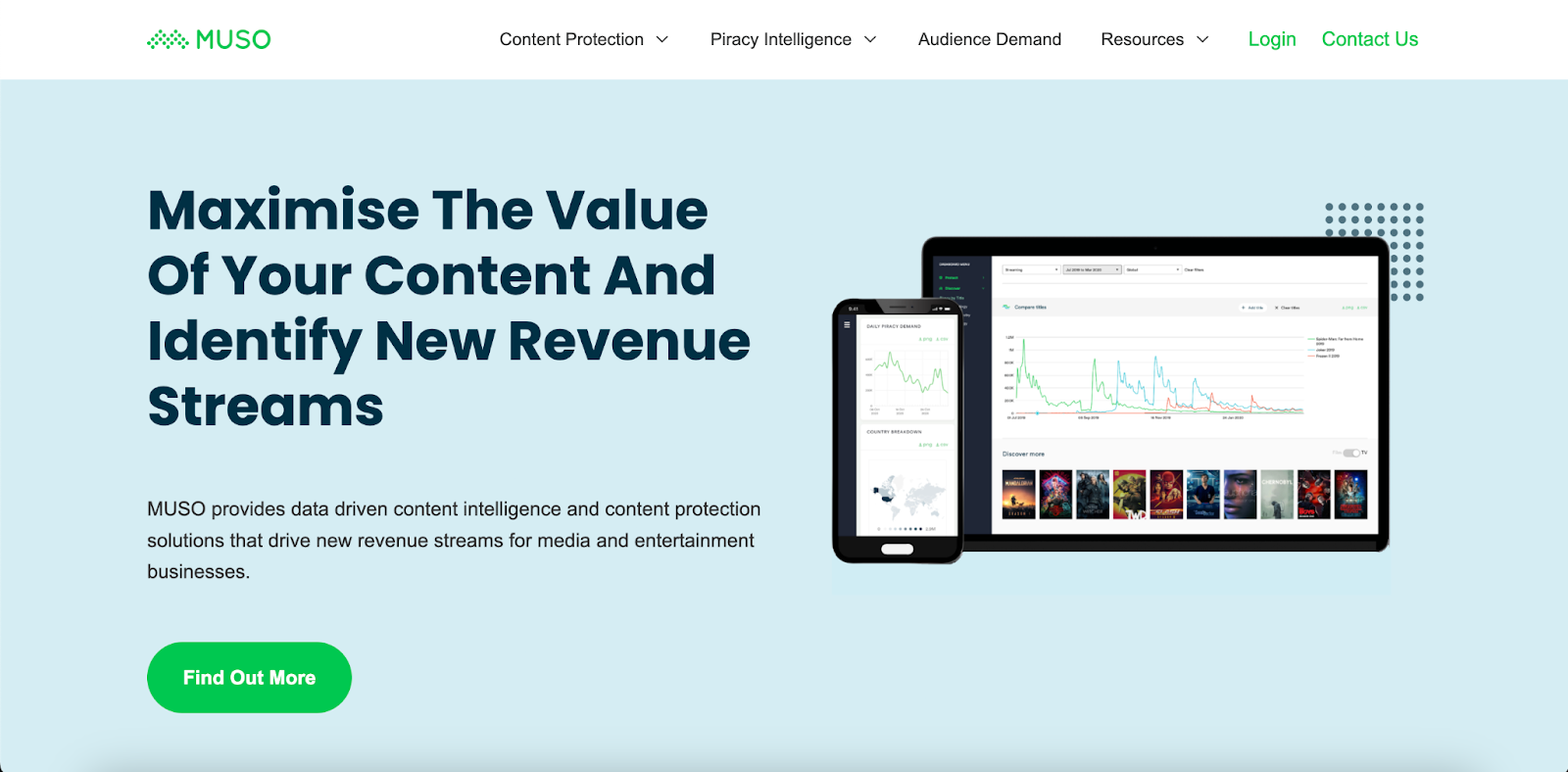
MUSO is a data company that provides an in-depth view of global piracy and unlicensed media consumption. The system monitors streaming, downloads from websites, torrents, and other major forms of piracy. Globally, MUSO’s data powers content protection, audience measurement, and monetization solutions.
The London-based company was founded in 2009 to protect clients’ IP and unlock the value of unlicensed content to global audiences. The company has grown rapidly in the entertainment sector since then, serving some of the largest global brands in film, TV, music, gaming, and live sports. A total of 50 MUSO employees work in London, Los Angeles, and Eastern Europe
Pandio
Pandio.com is a cutting-edge platform specializing in automated data processing and machine learning. In addition to simplifying complex data pipelines and machine learning models, the company provides organizations with efficient, real-time data insights. It offers a range of services designed to enhance data-driven decision-making and operational efficiency:
- Stream Processing: Pandio provides robust stream processing solutions that enable real-time data analysis, allowing businesses to react promptly to new information and trends.
- Machine Learning Orchestration: The platform simplifies the deployment and management of machine learning models, ensuring seamless integration and operation within existing infrastructures.
- Data Pipeline Automation: Pandio automates the creation and maintenance of data pipelines, ensuring continuous, reliable data flow and reducing the manual workload for data teams.
- Consultancy Services: They offer expert consultancy to help organizations optimize their data architectures and leverage machine learning for strategic advantages.
Final Thoughts
These insights and tools from leading providers equip businesses and storytellers with the necessary resources to tell compelling, insightful, and actionable data stories that can influence decision-making and drive strategic actions.
Following the outlined best practices enhances the narrative, making the data understandable by incorporating appropriate visuals, ensuring clarity, and employing interactive elements. Further, advanced tools from leading providers facilitate more profound insights and strategic decision-making.
Cover : Photo by Lukas: https://www.pexels.com/photo/person-holding-chart-and-bar-graph-669612/